
Team
3 Engineers
2 PMs
2 Product designers
My role
Founding designer
User researcher
Timeline
Phase 1: 3 months
Phase 2: 3 months
❒ Overview - from mvp to product
As the founding designer at Trusli, I played a pivotal role in transforming core features from MVP to a fully developed product. Collaborating closely with enterprise customers and stakeholders, I successfully shipped over 12 impactful features, ensuring user-centered design excellence. These efforts helped establish strong partnerships with four major clients, including NIO and Pony.ai, driving Trusli’s growth in the enterprise market.
This case study will demonstrate how I enhanced the product and designed new features to achieve key business and user goals.
❒ Context - Why we are designing this
In-house legal review is a bottleneck to company-wide productivity.
91% of in-house legal teams are short-staffed with a huge backlog of work.
⇲
100+ tickets/month
Lost sales opportunities, forfeited savings, high legal risks, and low productivity for broader teams causing millions of dollars loss.
⇲
40% of cycle time due to legal delays
Current CLMs or workflow tools can't eliminate the manual work or automate the entire process.
⇲
Using 3–5 tools to achieve one legal task
❒ Context - The loop of a contract review process

Challenge 1
Multiple fallback definition
Impact
Business model expansion:
Introducing a paid entry point into our business model.
Enhanced scalability:
Ensuring scalability across various functions by implementing multiple fallbacks.
❒ Context - Feature requirement
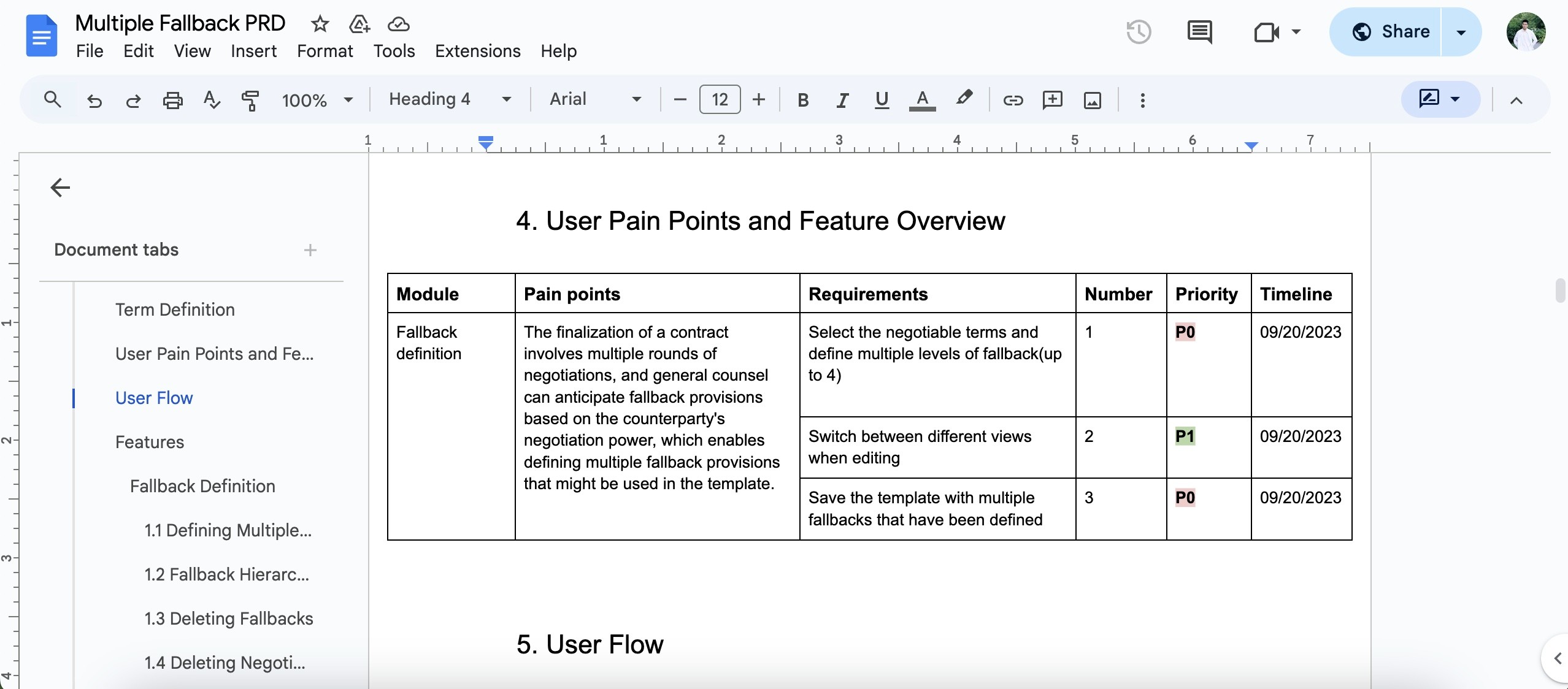
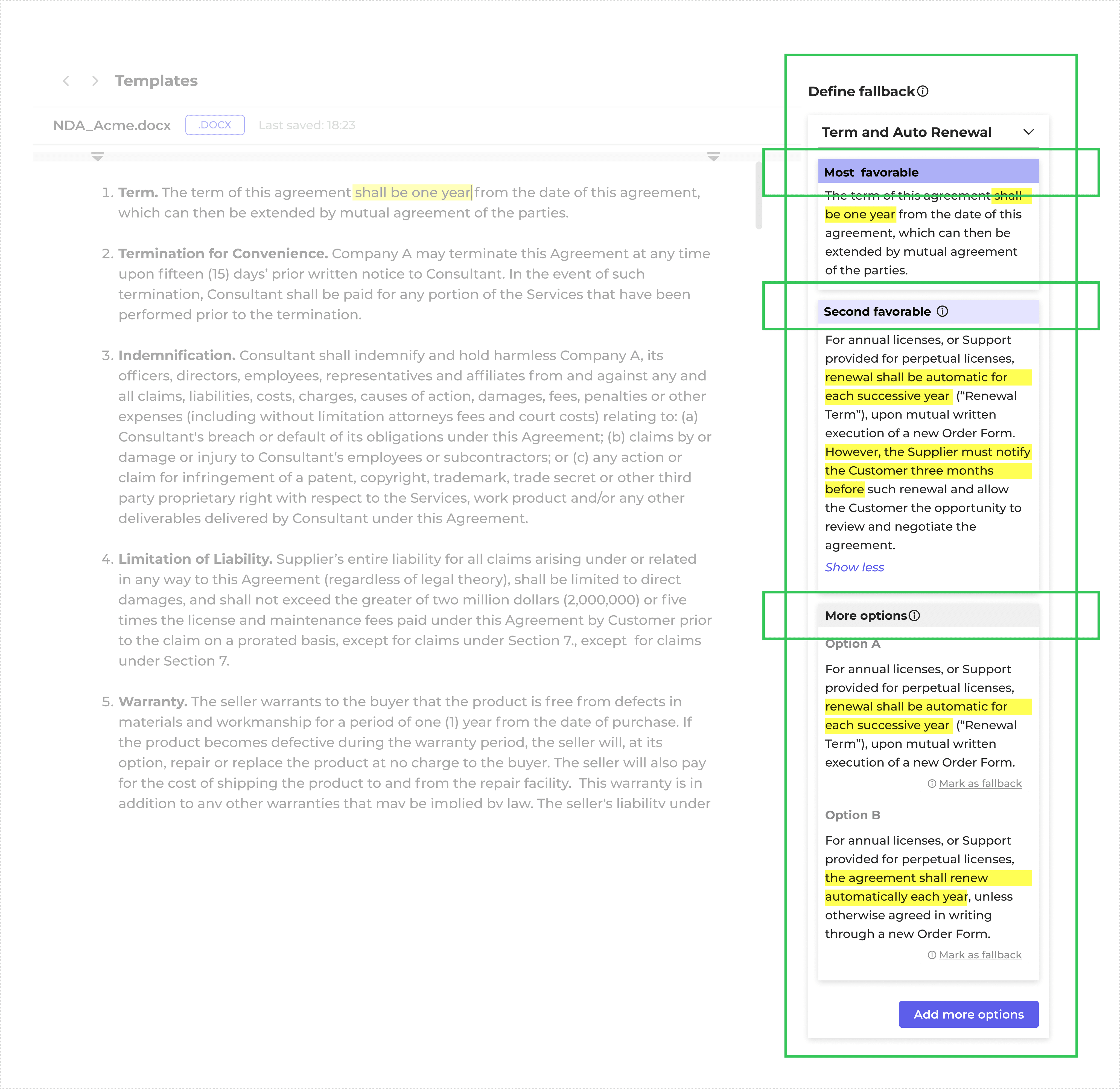
❒ What are the multiple fallbacks?
The term multiple fallbacks is not a name for a product feature but rather a setup that enables advanced features such as template generation and negotiation. This term is necessary because we need to differentiate the current single fallback setup. When defining templates, users should be able to add multiple fallbacks and assign an aggression level. A set of fallbacks should be able to cover necessary adjustments to the corresponding clause based on the progression of negotiations. Multiple fallbacks lay the foundation for enabling contract generation and negotiation.
❒ Design challenge 1.1 - Concept exploration
Concept 1

Pros
Space-saving: Utilizing tabs allows for a compact display, conserving screen real estate.
Cons
Lack of visibility for all levels of fallbacks on a single page: Users may find it inconvenient to compare and select options.
Concept 2
Pros
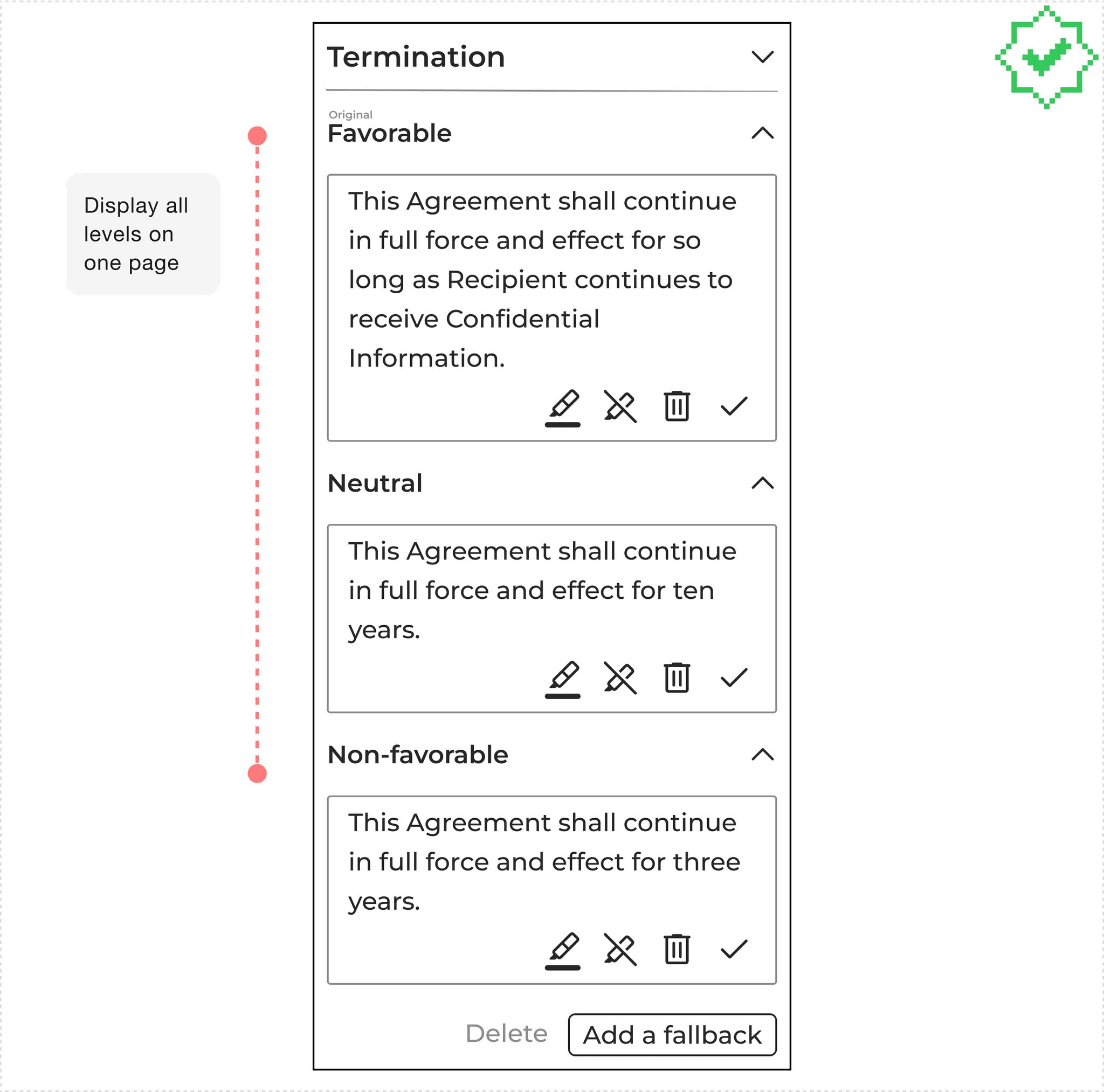
Full display on one page: Users can view all levels of fallbacks without navigating through multiple tabs.
Cons
Adjusting the favorability of one fallback option may indirectly affect another, reducing user control over the selection process.
❒ What I did to solve this
1.Design best practice research
I started looking at what competitors were doing. Since there aren't many real pages for ToB products, I broadened my approach by seeking out similar secondary competitors, like Google Docs. I even dove into how multi-level components are designed.

2. Design decision

However,
I got pushed back from our CEO
“We need to support at least 10+ fallbacks and support reorder function”
❒ Design challenge 1.2
My first step is to active listening to understand her real needs and why so many fallbacks are required.
I realized that the IA here has actually changed, meaning there can be many options within the non-favorable category. Therefore, each level needs a title to group the options, and we can naturally add the color code to the title background. For now, we'll abandon the stroke color code approach.
❒ Design challenge 1.3 - Reorder function
Constraint
Dragging is the simplest interaction. But after confirming with engineering, it's difficult to implement, so we need to think of another solution.
Concept 1 - Arrow icon button

Pros
Takes up minimal space
Colors can change with levels
Cons
Not intuitive enough
Concept 2 - Action button

Pros
Intuitive
Cons
Works well with three levels, but becomes less effective with more layers, especially when using very specific text buttons like "switch with xxx."
Solution

Use a more general text button.
I also consulted with the stakeholders about their workflow to understand if setting the order of all levels in advance is necessary.
They mentioned that the starting point is more important, meaning the initial version sent out is crucial.
Therefore, our design approach should shift from setting the order of all levels to focusing on finding the starting point.
However,
1.When finalizing the order, I realized that having multiple sorting options is very challenging for development.
2.By gathering data from users, I found that in real use cases, 4 levels are sufficient.
Data from clients Pony.AI & Cadence
❒ What I did
I presented my findings to the CEO and proposed design recommendations based on technical limitations and user insights. We ultimately reached a consensus:
⇲
Decisions
We will support up to 4 levels of fallback, arranged in order of favorability.
Additionally, we have agreed on a business model: free users can add up to 2 levels of fallback, while paid users can add up to 4 levels.
Since there're only 4 levels of fallback, we could bring back the color stroke method to show favorability.
My reflection
In a startup environment, one limitation is our lack of in-depth user research. So I still cannot be 100% sure that these two design decisions
1. the order of favorability and 2. a maximum of four fallback levels—meet user expectations.
So, I added "understanding user expectations for multiple fallbacks" to my design backlog, hoping to gather user data and insights later on.
❒ Design challenge 1.4 - Layout visual weight
Before
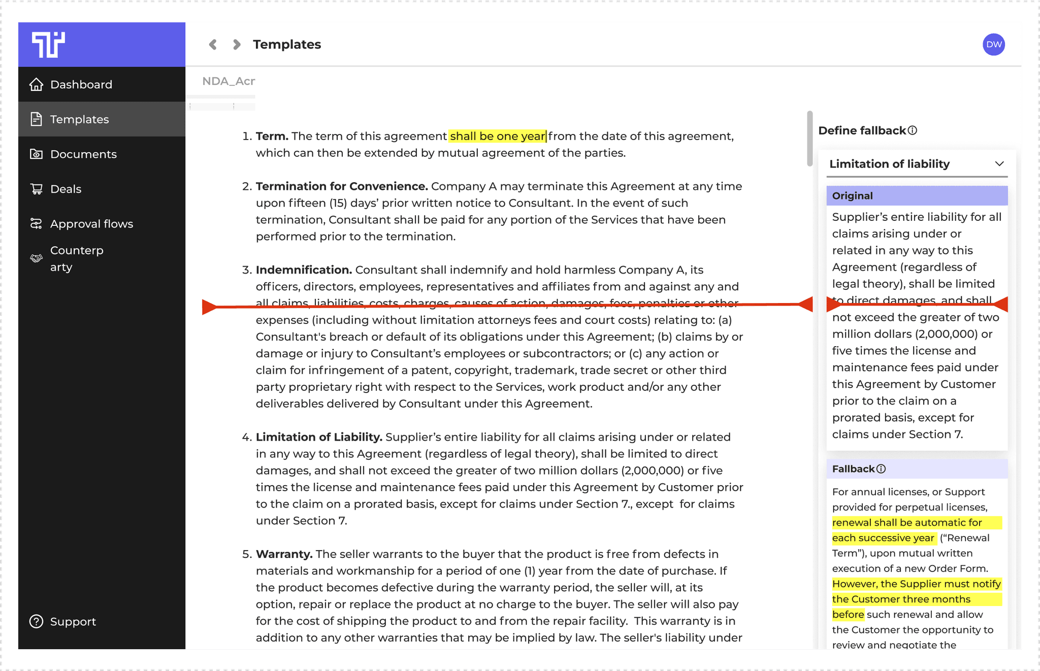
From the image above, it's clear that a single provision can take up half the screen. I tried viewing it on a desktop screen and found that it can only accommodate slightly more than one provision. This made me realize that the right panel needs more space, and the overall layout proportions may need adjustment.
After

What I did
I researched the proportions of left-right layout in document-type products and found the average ratio.
Then, I informed the stakeholders and engineers that we needed to adjust the proportions.
After confirming there were no technical issues, we settled on a 5:3 ratio and completed the high-fidelity design for the main workflow
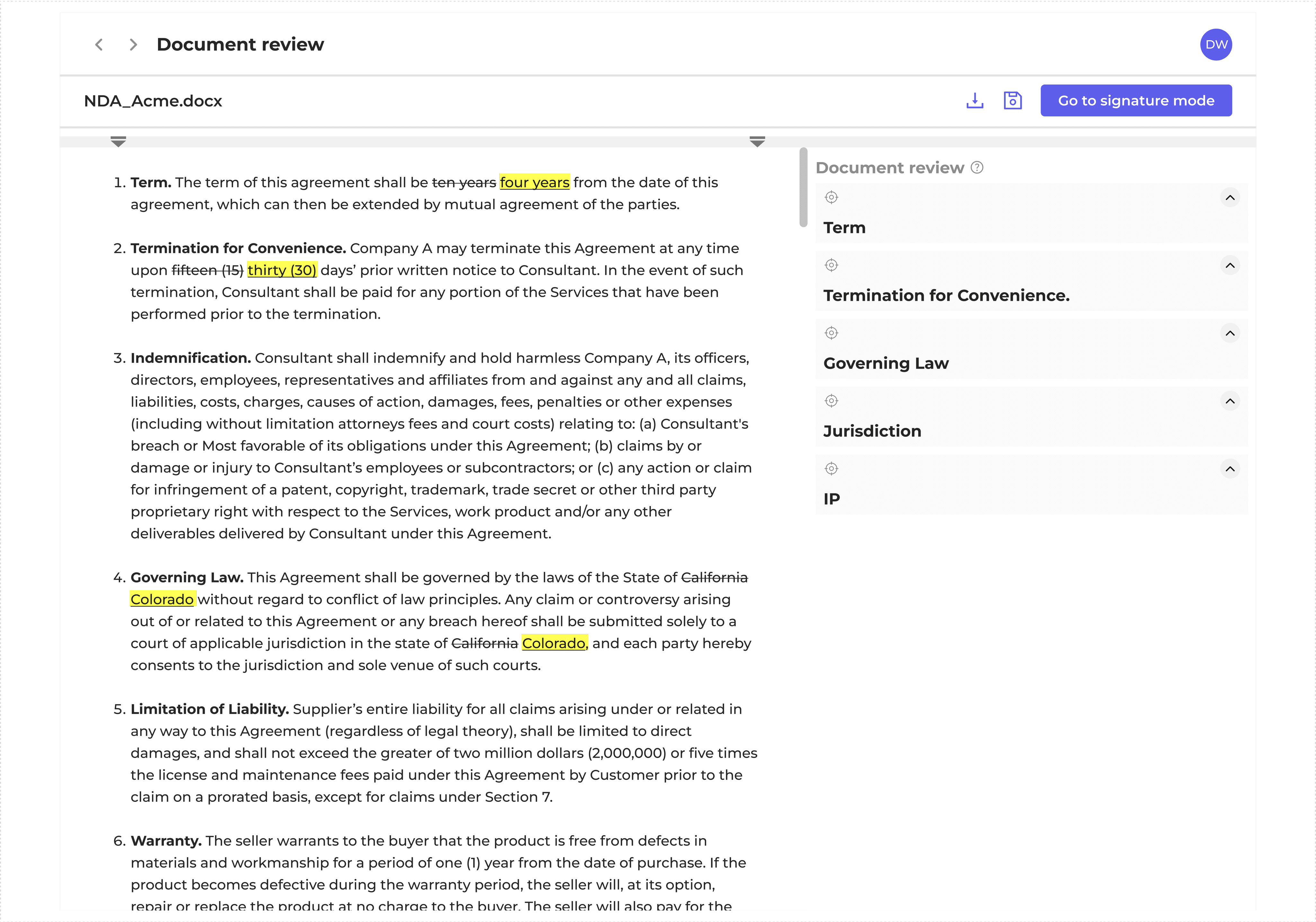
❒ Final design

Challenge 2
Multiple Fallback - Document comparison
❒ Map out user flow
My initial step was to map out the user flow to achieve two main objectives:
To help me understand how users interact with the system.
To identify any potential issues or areas for improvement in the interaction process.

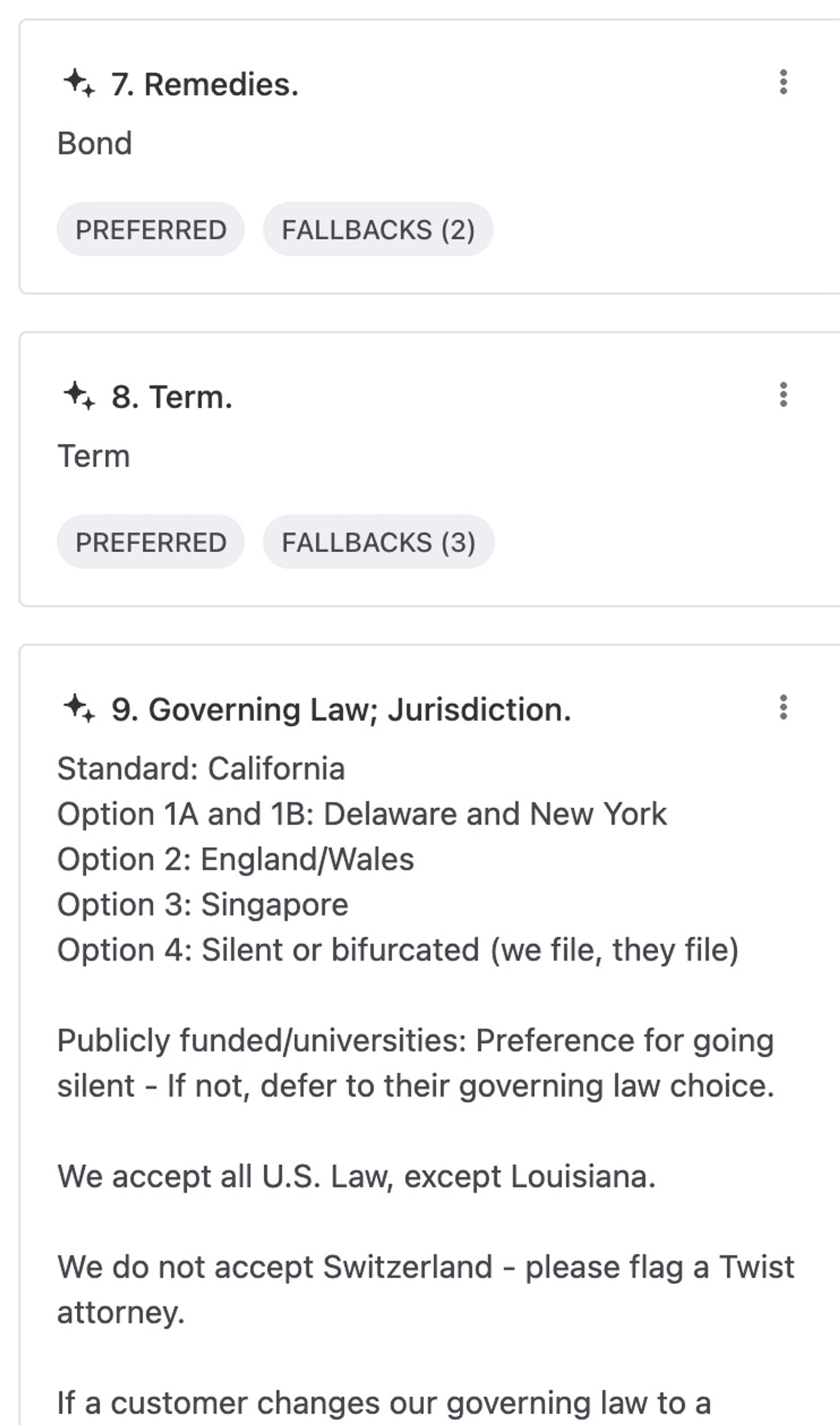
❒ Review feature
After having the PRD and general user flow in place, I took another look at the existing features and compiled a list of questions that need confirmation to discuss with stakeholders.

❒ Design challenge 2.1 - Review flow
Handling a markup, logically, requires first checking whether to accept the other party's comment. If not accepted, then choosing to use a fallback. Technically, it's a two-step process. At the time, there was a debate about whether to paginate the display.
Option 1: Click "Reject and Use Fallback" to display fallbacks

Pros
Aligns with lawyer behavior, allowing them to make a deliberate decision before proceeding.
Helps prevent the interface from becoming overwhelming by presenting fallback options only after rejecting the original comment.
Option 2: Direct display (Selected)

Pros
Saves a step by immediately displaying the fallback options alongside the original comment, streamlining the decision-making process.
Allows users to assess the fallback options and determine whether to accept or reject the original comment based on the available alternatives.
❒ Design challenge 2.2 - Markup categorization
1.Initial assumption
At first, we simply arranged the markup in the order it appeared in the original text with the assumption that this was the lawyer's workflow: reviewing markup one by one.

❒ Design challenge 2.2 - Markup categorization
2.Assumption validated
I discussed my findings with the PM, and I found that she was also considering categorization. At this time, Lucid Motors, one of our clients, reached out to us, expressing interest in a "one button reject all" feature. So, what would this "reject all" function reject? It would reject these markups that haven't been defined at beginning. This further validated our assumptions. Therefore, we began designing this feature, and the PM suggested that if we could batch undefined markups, we should also be able to batch defined markups.

❒ Design challenge 3.2 - Markup categorization
3.Design exploration

Potential Solution 1: Designing a regular button
But it doesn't easily allow users to undo actions, which can increase user uncertainty.

Potential Solution 2: Toggle Switch
Switching solves the problem of undoing actions at any time, but Markup actions's not binary.

Potential Solution 3: Radio buttons
We chose the radio button solution as it can address the issues present in the previous two solutions.
Just when I thought everything was settled, another challenge arose...
After categorizing the markups, the PM suggested we needed an indicator to help users distinguish:
Which markups have been reviewed.
What specific actions have been taken on the reviewed markups.
We decided to use tags, the most common indicator method. Initially, we planned to list all the specific actions, including
accept
reject
select 1st fallback
select 2nd fallback
3rd
4th
We also used shades of purple to differentiate the favorability of the fallbacks.
❒ Design challenge 3.2 - Markup categorization

However, after the design drafts were completed, I noticed two issues:
There were too many colors, which was disturbing.
The purple tags were easily mistaken by users as primary button colors.
To address these issues, we needed to simplify the colors.
Upon further reflection, I realized that users might not need to know the specific fallback used in detail. Instead, the indicator's main purpose was to allow users to quickly browse through reviewed markups when they are collapsed.
Even if a markup was tagged with "1st fallback," users would find it hard to recall the specific content of the 1st fallback when it's collapsed.
Therefore, it would be more effective to provide users with three simple actions:
accept
reject
select fallback


