
Team
4 Engineers
1 PM
1 UX designer
My role
UX designer
UX researcher
50% PM
Timeline
Phase 1: 1 week
Phase 2: 1 month
Phase 3: 2 months
❒ Overview - what is AIMine
AIMine is an AI-powered conversational tool that helps enterprise users explore curated, real-world AI use cases. It goes beyond generic chatbots by offering targeted, business-relevant insights tailored to customer challenges. Internally, it also supports sales and GTM teams with quick access to compelling use case examples. The tool embodies Gruve’s vision of “mining” AI value, turning complex knowledge into actionable guidance through a streamlined, chat-first experience.
❒ Context - Why we are designing this
Received a high-level requirement from C-suite
“Create an internal customer-facing platform, AIMine, to showcase curated, enterprise-ready AI use cases through a chat-based interface. The experience should align with Gruve’s “Mining” concept and support sales by making AI services easily discoverable. It’s set to launch soon and draws inspiration from competitors like Globant and IBM.”
Broke down into problem statements
Missed discovery and lower engagement
First-time visitors, often the potential customers are overwhelmed by the scale and complexity of services company website, finding it hard to surface solutions tailored to their specific business needs.
Lost opportunities and slower conversions
Sales teams want to identify qualified leads but can’t engage every visitor in real-time.
Transformed requirement into initiatives to drive design direction
1
Competitor research
To learn industry standard
To identify UX patterns
2
Appealing visual language
To effectively convey the “Mining” metaphor visually for a public facing tool like AIMine
3
Solid use case library
To lay the foundation for relevant, valuable AI output
1
Competitor research

Conversational or traditional?
We selected conversational option because it:
Delivers a more engaging, human-like experience that encourages personalized exploration of AI use cases and helps users surface relevant solutions in complex service environments.
Positions Gruve as a strategic advisor, guiding users like a consulting partner rather than functioning as a traditional support chatbot.
Big players have rich deep content. What about us?
Leaders like IBM and Cognizant have a rich library of content and use cases built over years. As a younger startup, we face a different challenge:
There’s an urgent need to collect, format, and co-create use cases with practice leads and newly acquired companies by Gruve to build a scalable foundation.
2
Appealing visual language
I designed AIMine’s logo using a mountain-shaped “M” to symbolize mining, with a star icon and gradient to represent AI and innovation.
Starting visual design early helped us:
Position AIMine as a branded, public-facing tool
Quickly align stakeholders by making abstract ideas tangible

3
Solid use case library
I shared competitor research insights and visual direction with stakeholders, and prepared to kick off key screen designs. While the team worked on developing new use cases, I used existing ones as temporary design references to move the UX forward.
Fun story
I quickly built an automation tool using Microsoft Copilot to help the team submit and approve newly created use cases more efficiently.

First draft
Designed the key screens for internal feedback
❒ Design process - 1st draft of key screens
Iteration
Led design review and synthesized stakeholder feedback
Defined a clear design direction and wrote the PRD
Design challenges
1
Unclear entry point
2
Weak emphasis on use case experience
3
Low user engagement and missed sales potential
Design challenge 1
Unclear entry point
Technical limitations made it difficult to embed the tool directly within Gruve’s main website.
The marketing team was redesigning the website, creating misalignment in ownership and navigation flow.
❒ Solution
Separated the tool from the main website and repositioned it as a standalone, conversation-first experience.
Add a good entry point to enter AIMine.
Removed the static use case listing page to fully embrace a chatbot-driven interface.
Problem of current solution

Solution 1 (Selected)

Solution 2

Solution 3

Fun story
I acted like a 50% PM to write a detailed PRD since there’s no a dedicated PM in team back then

Design challenge 2
Weak emphasis on use case experience
Users are unclear about the tool’s purpose due to the lack of an introduction or clear onboarding guidance.
Use case outputs are inconsistent and unstructured, making the experience feel disjointed.
There is no clear way to guide users back to relevant use case topics after interaction.
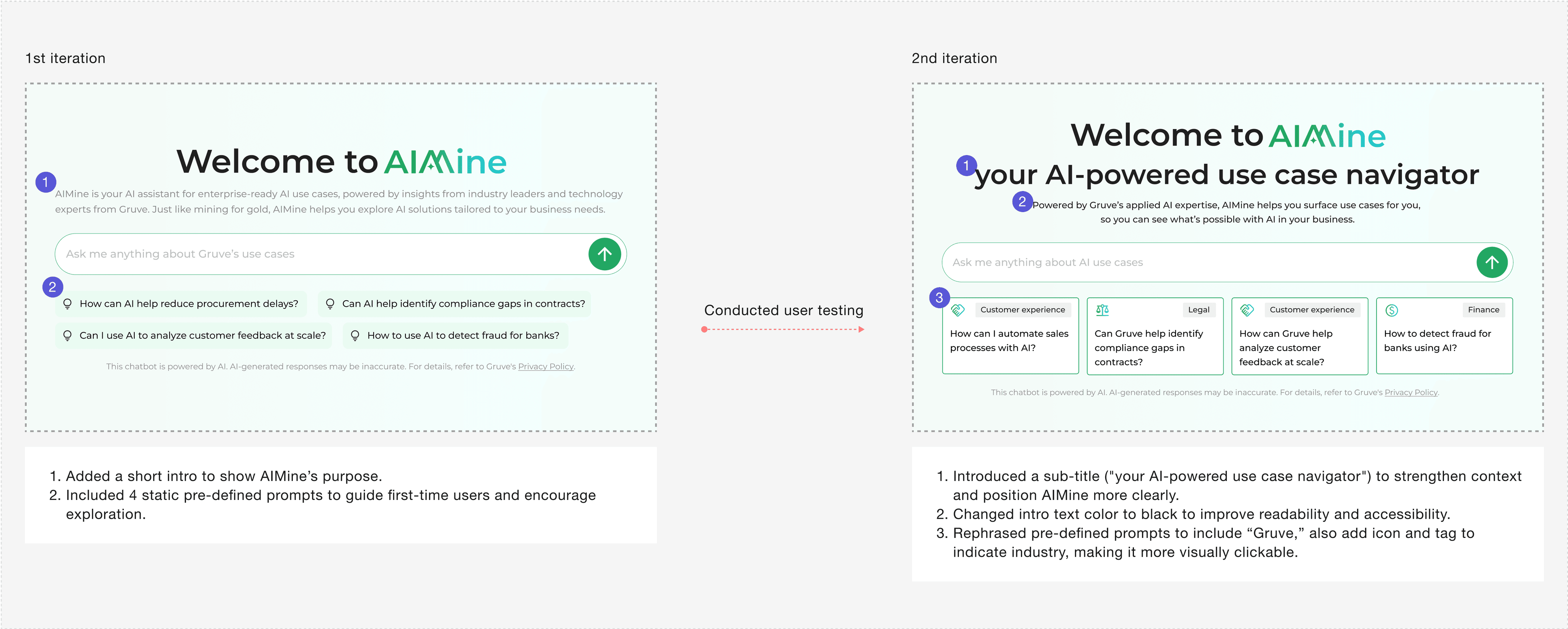
❒ Solution 1 - Added AIMine introduction and pre-defined prompts
❒ Solution 2 - United use case output structure

I collaborated with the team to develop a 7-point use case structure to make AI-generated outputs more consistent and easier to maintain in the use case library. However, after testing with users, we found that this structure was being applied too rigidly. It appeared not only for use case-related queries but also for broader or deeper follow up questions—such as “What are Gruve’s offerings?” or inquiries about specific technology stacks. As a result, the AI’s responses became repetitive and overly predictable, limiting the depth and flexibility users expected.

AI output is difficult to control. To address this challenge, I proposed giving users more agency by allowing them to choose whether or not to view the full use case structure. This approach helps balance consistency with flexibility, ensuring structured outputs are available when helpful, but not forced in every response.
Solution 1
Add a button

Rejected
Visual distraction: Stakeholders felt the introduction of a separate button created visual noise that pulled attention away from the main content.
Technical complexity: Embedding button components inside AI-generated responses introduced implementation challenges and added complexity to the system architecture.
Solution 2
Keep it conversational

Selected
Highlighted prompts blend naturally into the chat, making the experience feel more fluid and less interruptive.
I added a related use case card to help redirect users to the relevant Gruve page for deeper exploration.
Option 1 - Link below each use case

Rejected
Visual distraction: Extra buttons created noise, pulling attention from main content
Technical complexity: Embedding links in AI-generated responses added implementation challenges and system overhead
Option 2 - Consolidated links in bottom section

Selected
Cleaner design with less visual noise
Easier to implement technically
Keeps focus on conversation while still providing access to details
❒ Solution 3 - Organized user queries and came up with a response guidance

Design challenge 3
Low user engagement and missed sales potential
Only one passive method available to collect potential customer contact information.
Users visit briefly with no follow-up interaction or ongoing engagement.
❒ Exploration 1 - User account VS only collect user basic info

In the current solution, users must fill out a contact form before copying AI-generated responses. This is the only point where we collect user information.
However, early user testing shows that most users are not motivated to copy the content, resulting in low form submissions and limited lead generation.
We need to introduce more engaging and strategic entry points to capture user information and drive better business outcomes.
❒ Solution 1 - introduce user account

Instead of asking users to only fill out their email, we encourage them to sign up for an account to access the full AIMine experience. This approach offers several benefits:
Enable personalized experiences
A user account allows us to save preferences, track AI queries, and recommend relevant use cases tailored to each user’s industry or role.
Drive engagement and retention
With a user account, we can support features like saved sessions, recent searches, and follow-up recommendations—encouraging users to return and explore more.
❒ Solution 2 - Add more gates
